Tuesday, March 23, 2010

Money Management, Behavioral Economics, and Interaction Design

image by AMagill

In search of a money management application for my iPhone, I came across MoneyBook, a beautifully crafted app. The creator/developers have done a wonderful job on the app, and the ethos surrounding it. They currently keep a well updated blog, that gives tips for using the app and details their reasoning and and challenges behind the apps continued development (I particularly enjoy "the importance of an app icon" entry). All of this work they have shared surrounding the app, illustrates a work of passion to me, taking into account the user experience beyond the app itself (Note: as of writing, I still haven't purchased the app, because I'm that cheap when it comes to app purchases Update: I purchased it).

Being aware of my ability to be wooed by gorgeous interfaces, I looked online for reviews of Money Book. Many of them have come back very positive (iPhone App Review, 148apps Review and Just Another iPhone Blog). I also looked at the reviews in iTunes of the application. I often look for reviews in the extreme of the spectrum first, and was interested in a particular review that commented that Money Book is a copy of Pennies. I believe the side by side screenshots below will show this to be a fair criticism.

Just to be sure, I checked to see if they were the same developers (which would be odd), and they're not. Pennies is made by Austin and Clemens of Design by a Knife, while Money Book is made by Sandro and Mischa of Noidentity. That is the end of that investigation for now, I will leave that story to someone else. From a visual critique, I have to say I prefer Money Book over Pennies. The meter gauge over the fuel gauge is more appealing, along with other touches, such as richer colors and subtle textures. Even the name, Money Book is more preferable to me than Pennies (its aspirational rather than miserly).


After only watching youTube videos of the applications in action, they seem extremely similar, supporting the criticism that caught my eye in the iTunes comment. I am well aware that the Money Book Promo is done by the creators of Money Book, while the Pennies review is done by user/reviewer. This gets to my final topic of this post, the Money Book people created a youTube video (4 actually, 2 about the development/evolution), while I couldn't find one by Pennies. Pennies does have a visual demonstration on their website, but the story ends there. Money Book has videos and a blog they follow closely, where they reveal their character and purpose not just of the app, but of themselves as well. As the reviewer in the Pennies app states, there are a few features that Pennies doesn't have which would be nice to see, like a notification when he is going over budget.  Money Book doesn't have this feature either, they do have reasoning why they don't though. Noidentity's reasoning is presented to me in such a manner that I want to adopt it.

I've looked at other money management applications before (iXpense It and some app that I've forgotten the name), and I stopped using them because they were overly complex with their options. While some of the added features on these other applications might have been very useful, they weren't motivating. When Noidentity explained the reason for the icon of Money Book, I identified with that, I want a beautiful icon on my iPhone screen. I want an icon attractive enough that I put it on my home screen, and when its on my home screen, I use it more. I want it to function with just enough, that it doesn't create extra information, but simplifies what I already have. That is the success of Money Book, they've created an attractive, simple to use interface, that I want to use.

Money Book is a great example of interaction design, that extends beyond the interface. My aspirational goal, is that if I use this application, I will see where I am spending my money, and be able to adjust my spending according to other factors in my life. Measuring and visualizing is the the first step for me though, and this application will allow that. The combination of aspiration, interaction and measurement is the Behavioral Economic part of this post. Rationally, I should just keep track of my spending habits on my own, in a notebook, but I haven't been successful yet. Hopefully this is the game changer for me.

Monday, March 22, 2010

Gaming to Save the REAL World


Great TED talk by Jane McGonigal, seeing the more optimistic side of gaming. She says that gamers learn four things when playing games:
Urgent Optimism - the desire to act immediately believing in possible success.
Social Fabric - gaming creates trust between people.
Blissful Productivity - knowing we're happier working hard than doing nothing.
Epic Meaning - people love being attached to awe inspiring missions.

She says this creates empowered people who believe they can change the world... the virtual world. So, she's gone about designing some games that create more interaction with the real world. Amazing stuff. Check out her latest game experiment at Urgent Evoke, where by playing, you will learn social innovation skills, and get certified by the World Bank Institute if you complete the game! The Evoke Vimeo instructions voice narrator sounds like Splinter from Teenage Mutant Ninja Turtles (not exactly the same, but similar). I signed up, because it can't hurt to play along for a while (I have some free time) and see what is going on.

Monday, March 15, 2010

Bioprinting Organs


NPR does a short report on a 3D Organ Printer Prototype by Gabor Forgacs at the University of Missouri. See the University's website on Bioprinting here. While I think this is amazing, and am happy that it gives me a reason to link to a clip from the 5th Element, I'm not clear as to what is new news about this. The very smart people at the University of Missouri  have been in the news about this for at least the last 5 years, and are self reported to be as equally far from initial human testing. I was hoping the article would mention a new break through, but it didn't. Sigh... it is a far off future indeed.

Saturday, March 13, 2010

Design Process InfoGraphics

A collection of information/visualization graphics of the design process from around the web. They are here for their variety in perspective and representation. Favorites are noted.


One of the most accurate infographics on chaotic human element the design process, "the squiggle" originally done by Damien Newman of Central Office. (This is a personal favorite)


Make Magazine's Online explanation of the design process is too the point, and if you visit the page, written out well. I agree with their cycle of build/evaluate/redesign.


I personally enjoy hand written diagrams such as this one from Life is a Design Thesis. The element that made it worth posting was explicitly noting that the design should answer the initial question.


Mike Ditullo's comparison of the written design process to how it actually happens, available at ThinkMakeDraw.


Taco Lab's iteration focused, sketchy design process. Very similar to the squiggle, I enjoy this one a lot.


Frog Design's process of Discover, Design and Deliver.


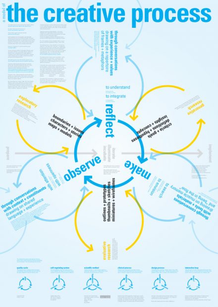
Dubberly's overly stylized design process infographic, that has a lot of useful elements when you get past the intense graphic.

Flow Interactive's User Center Design Process, promotes a continuous evaluation of designs.


Telono's User Centered Design process visualization.


Brannen's circular design process, with descriptions of each stage.


Funnel graphic of the design process by Goddard Technologies.


A design process that put a man on the moon, courtesy of NASA. It is actually an old challenge of theirs for student teams to build a plant chamber.


Akendi has interesting wording incorporated into their design process centered around human experience. Adding the person in the middle does a lot to say that they are human centered.


The group at Birdsong Creative incorporate celebration and many meetings in their design process.


From www.aiswebdesign.com, simple graphic, that leaves too much to consider and isn't explained on the website.

Source Design Against Crime, a beautiful graphic, that is not as intuitive as I'd like.

Source from Industrial Design Queensland, the top of a long graphic with detailed specifics of the design process. The description is mechanical, but a well documented project.


Zurb's Design process for Interaction design.


Anthony of Design Bit share's his web design process.

Friday, March 12, 2010

Pad Notes

This is the application I have been waiting for on a computer. I need the ability to type and draw in the same document, and export PDFs. Does such a thing exist for Mac OSX? It would be nice to save myself $500.

Thursday, March 4, 2010

Technology and Humanity

I have come across a number of articles lately that talk about the intersection of Humanity and Technology. First, there is the Kevin Kelly's recent TED talk on How Technology Evolves, in which he clearly states that Technology is Humanity. I was convinced with the argument he has set up.


I came across this article on PSFK, on people liking Roomba's because they are like us (faulty). There is also discussion of how people are adjusting and incorporating technology into our lives by naming devices and humanizing them. This humanistic element as faulty can be seen the the 2008 Pixar movie Wall-E. The thing that makes the main character so lovable is that he is not operating exactly as programmed. He is an hyperbole today's Roomba, figuratively and literally. There are also subtexts to Wall-E that speak to the dehumanizing aspect of technology, specifically in a mechanization and homogenization of life.


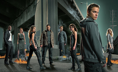
The combination of these articles and meanderings reminded me the late 80s film, Robocop, by director Paul Verhoeven. Somewhere in the commentary track, Mr. Verhoeven notes that one of his goals with the film was a reaction to other films at the time that pitted man against machine. Robocop on the other hand, was about a man thrown into the middle of this evolution, who had to come to terms with himself as technology. I think a trend in films from man vs. machine to man & machine could be plotted, and we would see an increasing number of films with people coming to some kind of peace or mediation with humanity and technology (the Matrix trilogy, iRobot, Ghost in the Shell, Battlestar Galactica 2004 series, etc). The Terminator series, started by James Cameron, has a recently updated storyline through the TV show on USA (Sarah Connor Chronicles), that started to hint that in the future, not all machines wanted to destroy humans. Some it seemed would choose to aid humanity, and did not need to be reprogrammed.

image source spoiler tv

What does all this mean though? I think it supports Kevin Kelly's proposition that Humanity is Technology. Sometimes in the race to extend our grasp, we get so focused on the reach, that we forget why we are reaching (there are some great thoughts and subtexts to this in The Prestige, Battlestar Galactica, and Steamboy), and extend our hands hoping to grab anything that come along. Many of the films and shows I have sited, are full of warnings of the what happens when Humanity and Technology come to an intersection. More and more stories are forming conclusions and stories about how this intersection can be resolved in a win/win scenario rather than a zero sum game.

Luxury Changes People

Harvard Business School study on the effect of Luxury on people (mindsets and outlooks). Quote from the article: "Luxury does not necessarily induce one to do harm to others, but simply causes one to be less concerned or considerate toward them."